Designing for people who read the docs first
tBTC is a decentralized Bitcoin bridge—infrastructure that lets Bitcoin move into DeFi without trusting a centralized custodian. The audience was almost entirely developers and protocol engineers. They don’t respond to marketing. They respond to precision, transparency, and proof.
When your audience can read your smart contracts, your design better be as honest as your code.
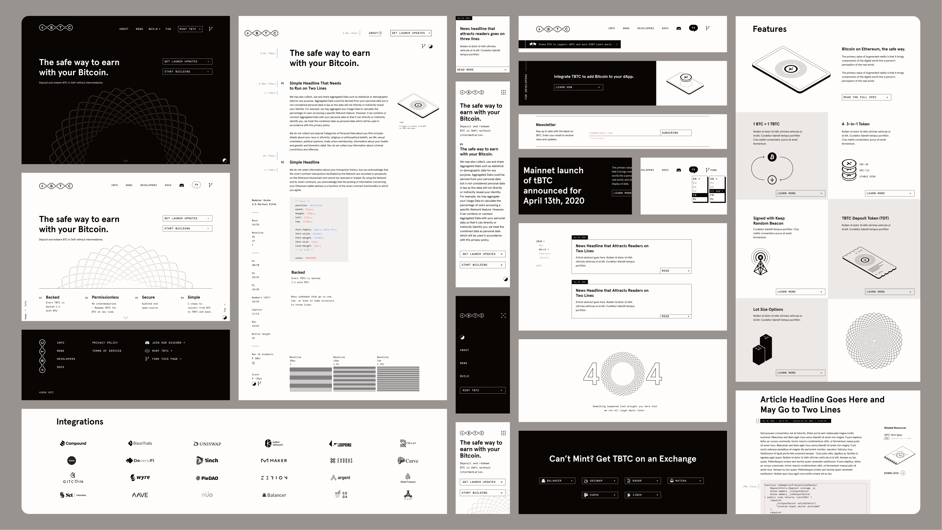
A spec sheet, not a sales pitch.
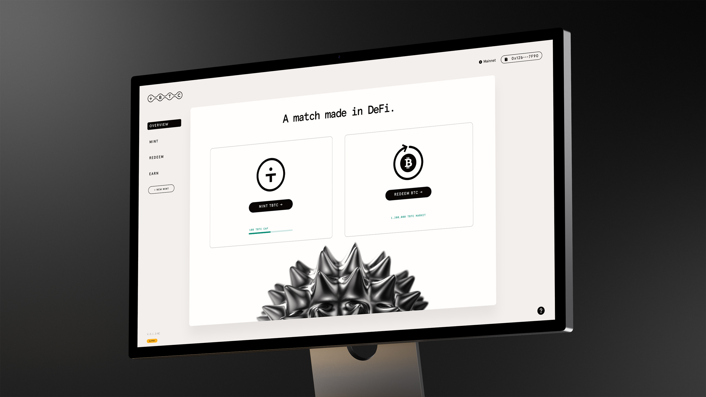
The visual language was built to mirror how the audience thinks: high-contrast, structured, and precise. Parchment tones and deep black gave the brand a weight and seriousness—unlike other crypto-neon approaches, tBTC’s design said we meant business and that you could trust your Bitcoin would be safe and sound. Isometric thin-line illustrations mapped the system’s architecture in a way developers could parse at a glance—no decoration, just clarity.
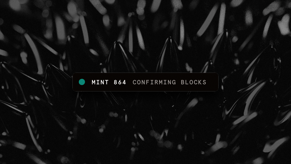
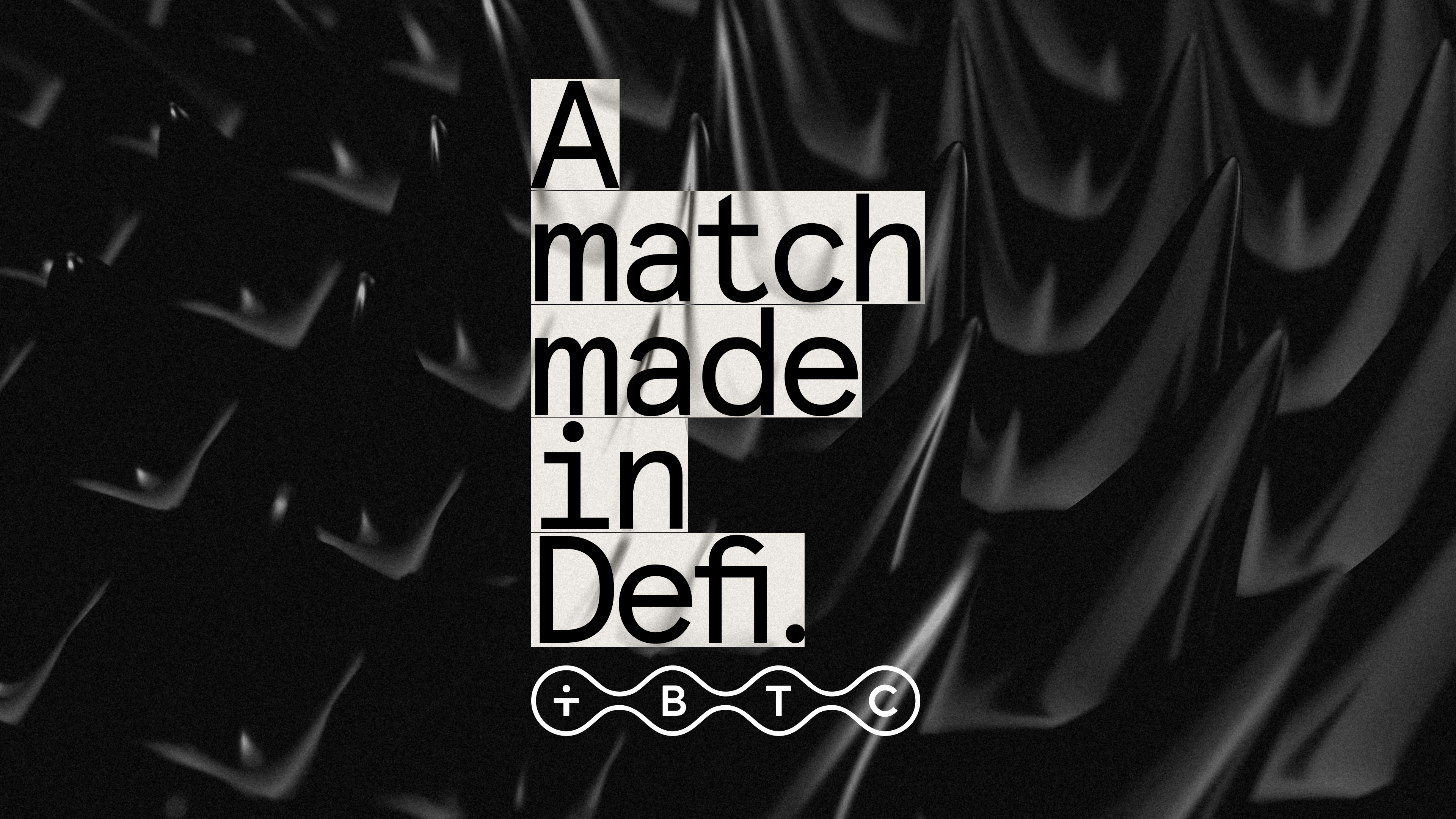
To bring texture and dynamism to a brand that could easily feel sterile, the identity introduced black-and-white ferromagnetism imagery—iron filings responding to invisible forces. Simultaneously metallic and fluid. Grounded in physical reality but with an uncanny quality that felt right for what the product actually does: moving Bitcoin between blockchains while keeping its integrity intact.

Still bridging.
tBTC has been operating safely for over five years, has bridged $4.8 billion in accumulated volume, and now powers infrastructure across Ethereum, Arbitrum, Base, Polygon, Sui, Starknet, and Optimism. It also serves as foundational infrastructure for Mezo. The protocol has since transitioned to the Threshold Network DAO—a new team, a new brand, and continued expansion. The original design work served its purpose: it earned the trust that gave the product time to prove itself.