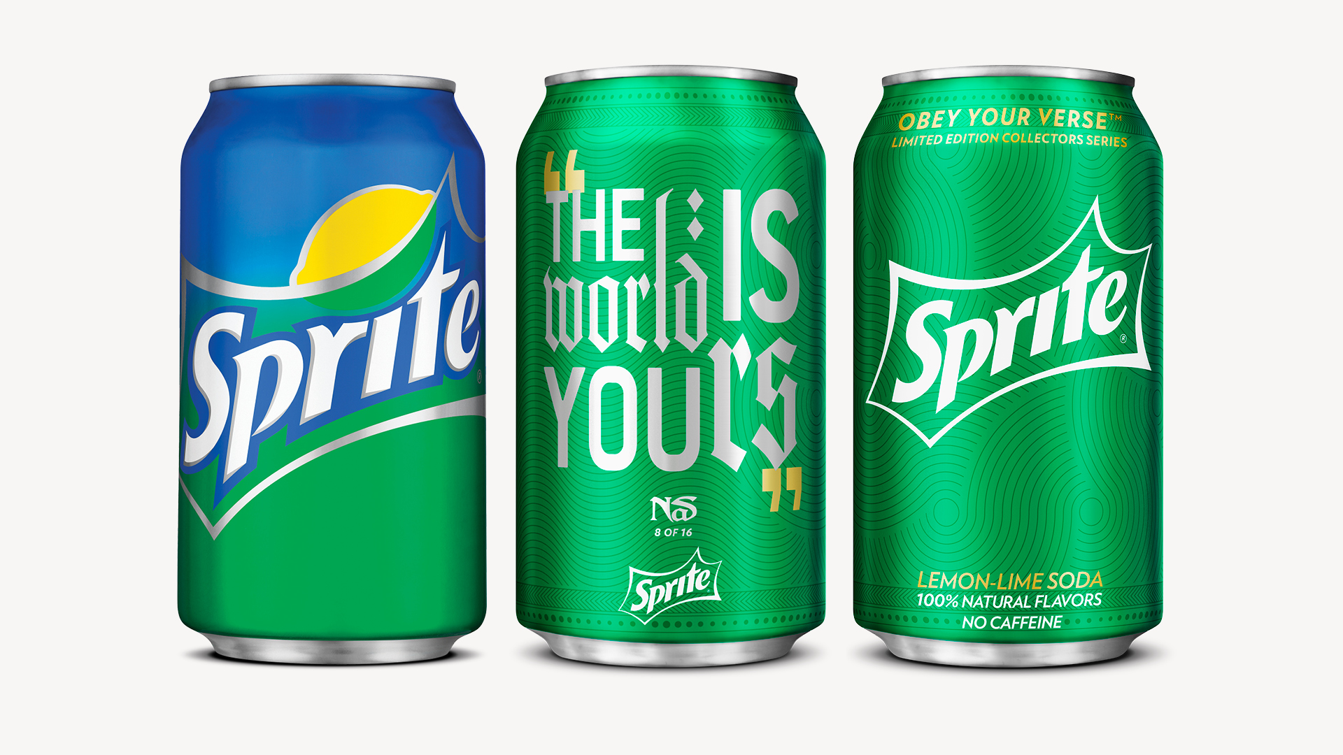
How do you design packaging worthy of the voices on it?
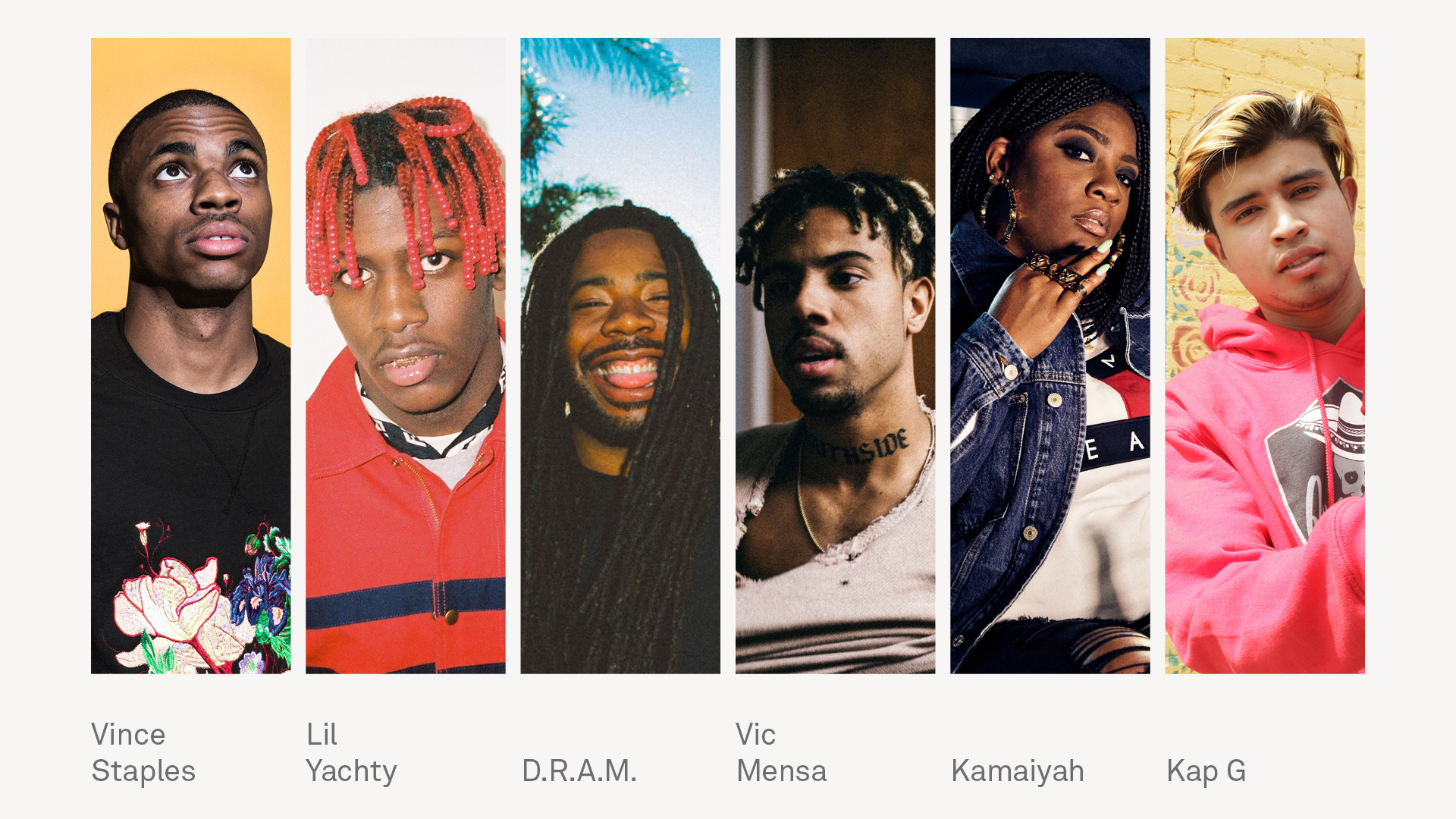
Sprite had a long, credible history with hip hop. But by the mid-2010s, hip hop had evolved from subculture to the culture; a shift led by teens, aka the vanguards of cool. Obey Your Verse was Sprite’s response: a limited-edition summer program built around the artists who defined hip hop. I led design across three years of releases, treating each can as an homage to the music and the lyricists.
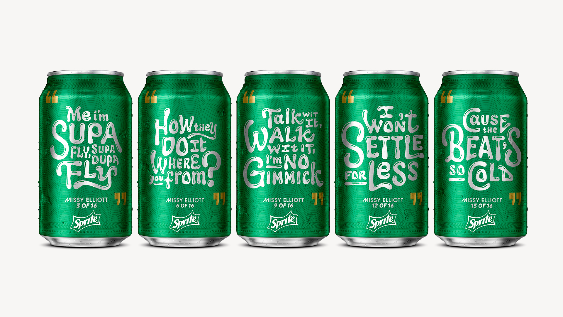
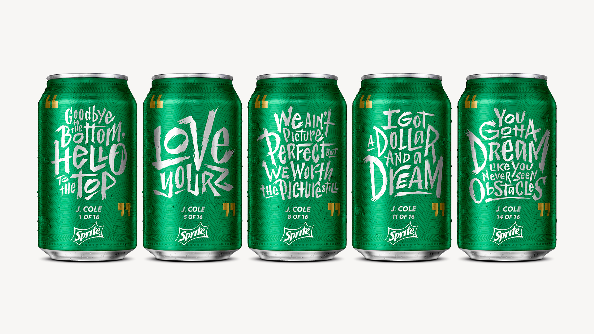
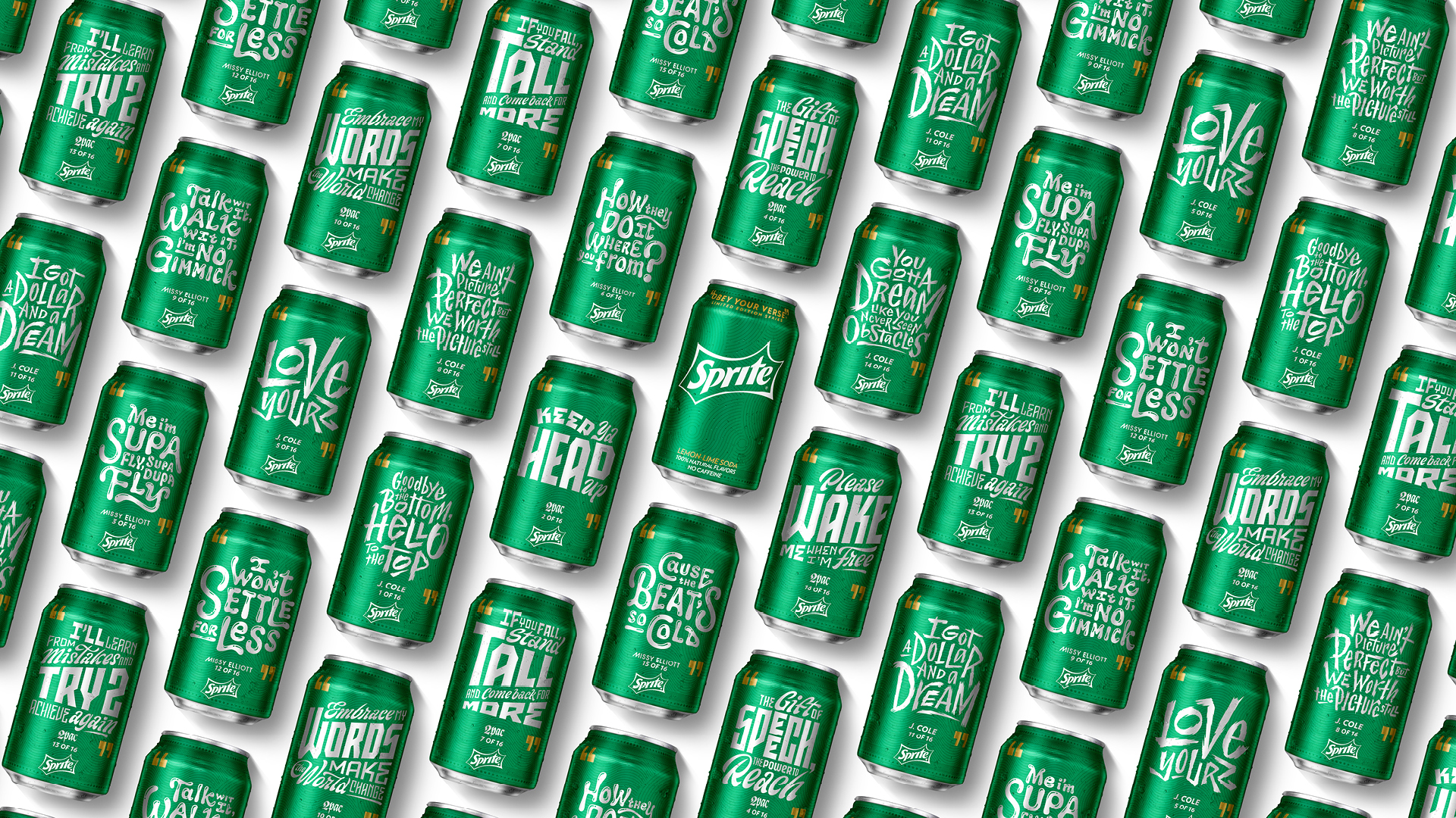
Coca-Cola proved variable-printing with the Share-a-Coke campaign—names across millions of cans. Sprite’s challenge was harder: fit full verses in a space roughly the size of a business card, and yet feel special. The design had to honor the music and the artist to evoke a unique, authentic, and iconic moment. The inaugural year referenced iconic album art, an unmistakable nod to longtime fans.
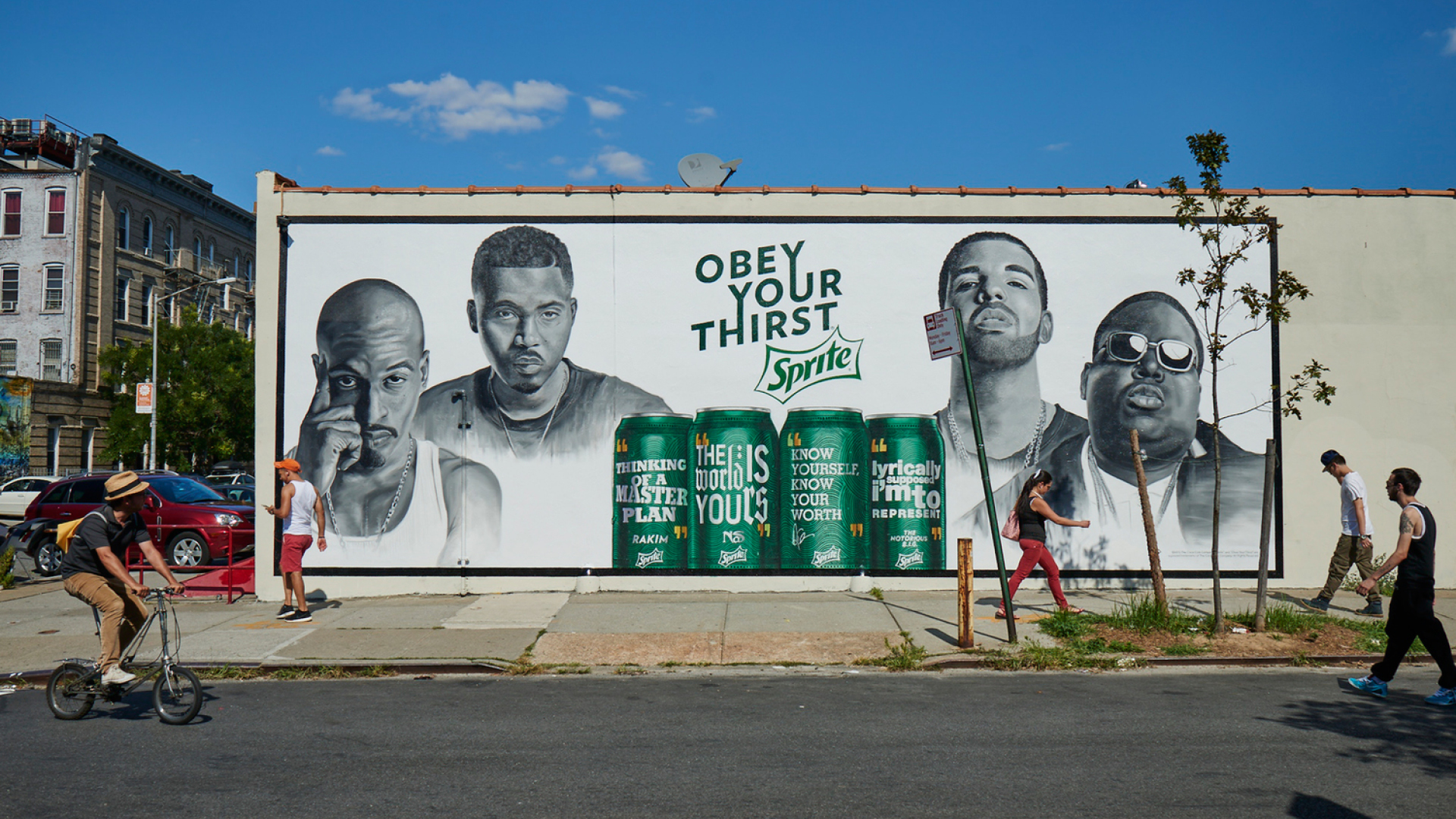
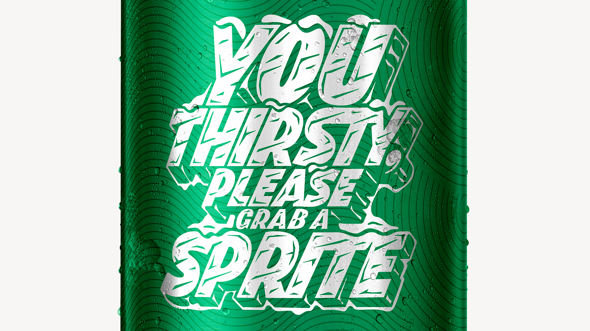
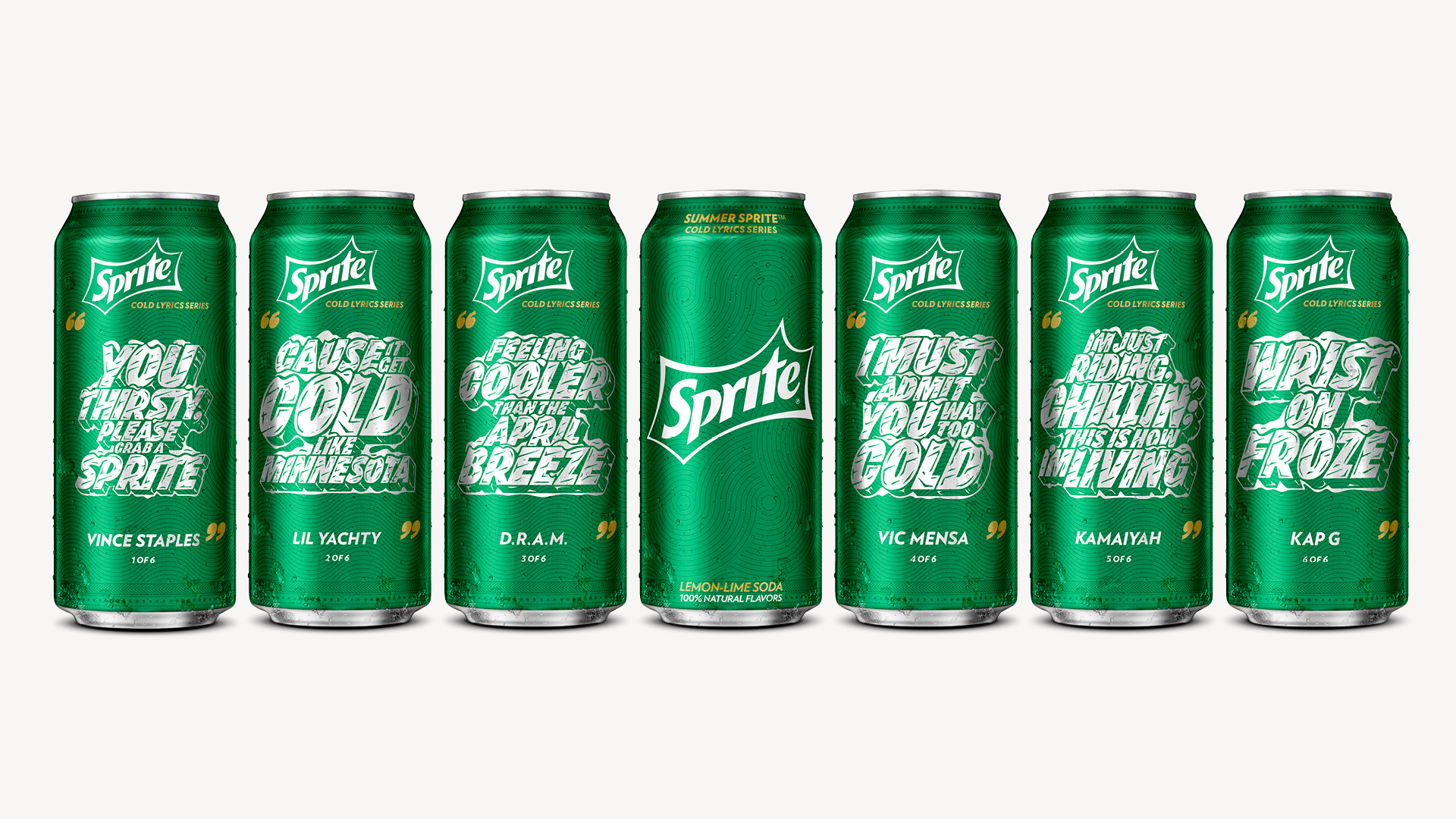
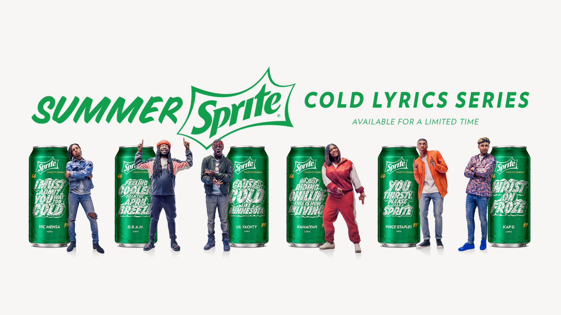
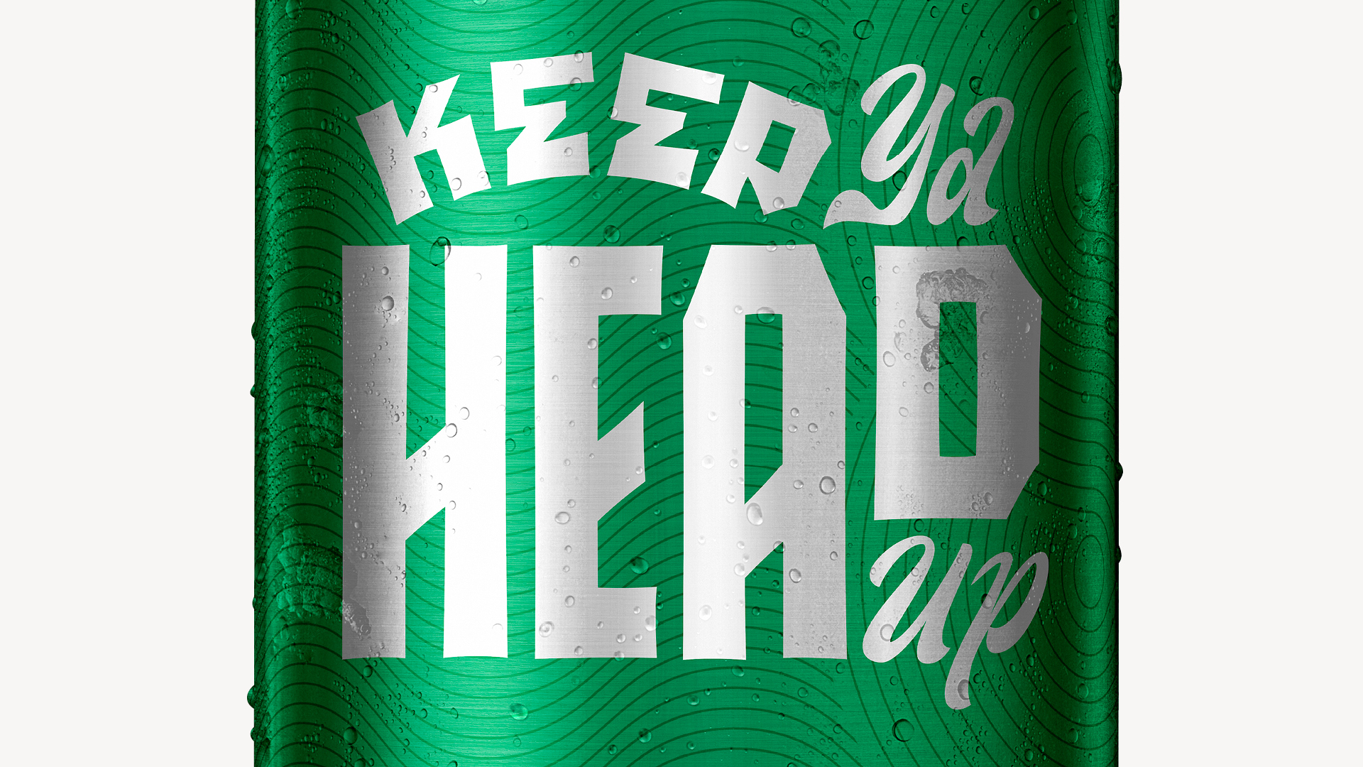
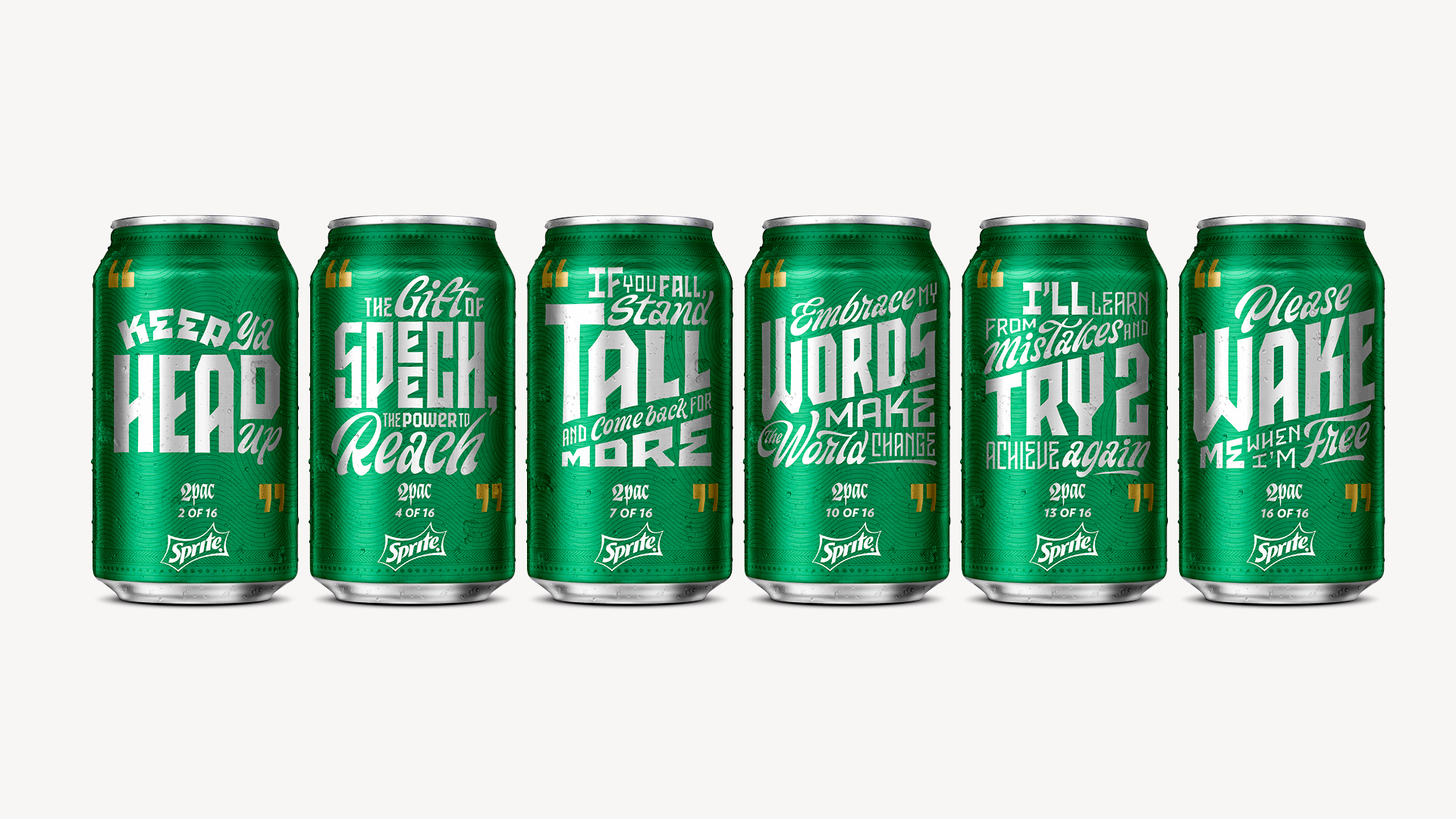
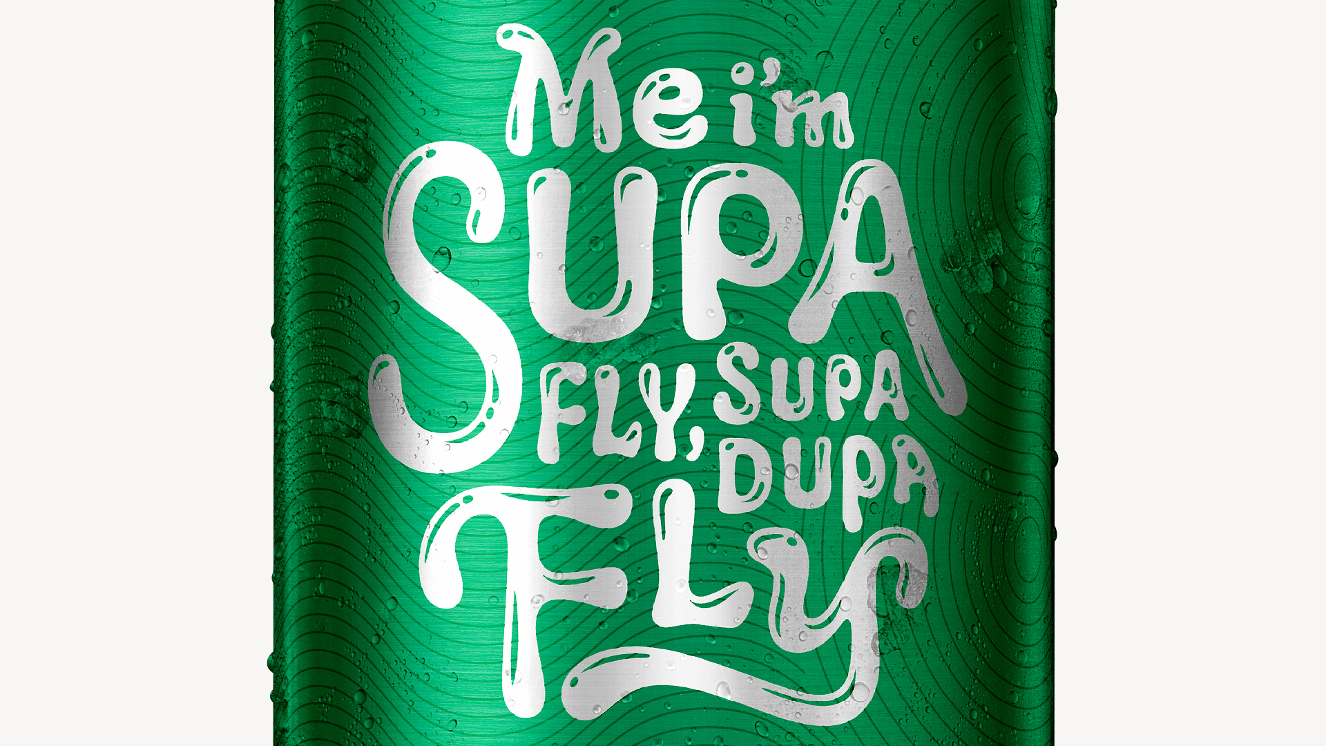
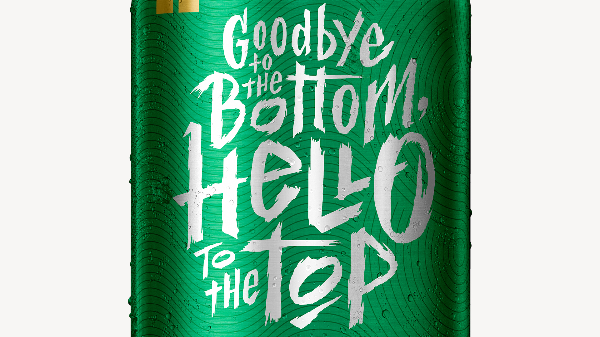
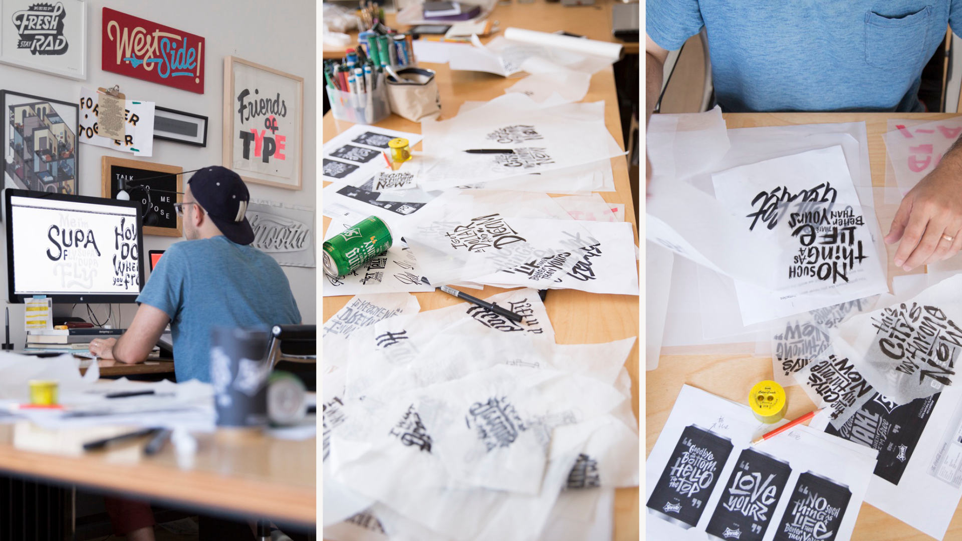
Sequels flop without fresh content. In year two, I commissioned Erik Marinovich to hand-draw every verse. The goal this time: tune the typography to the artist’s voice. The lyrics gained a synesthetic charge. The fridge packs gained a street-wise throwback. More collectible and personal. Closer to vinyl than packaging.
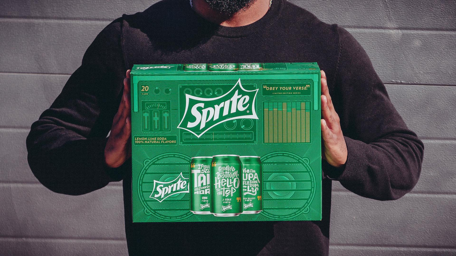
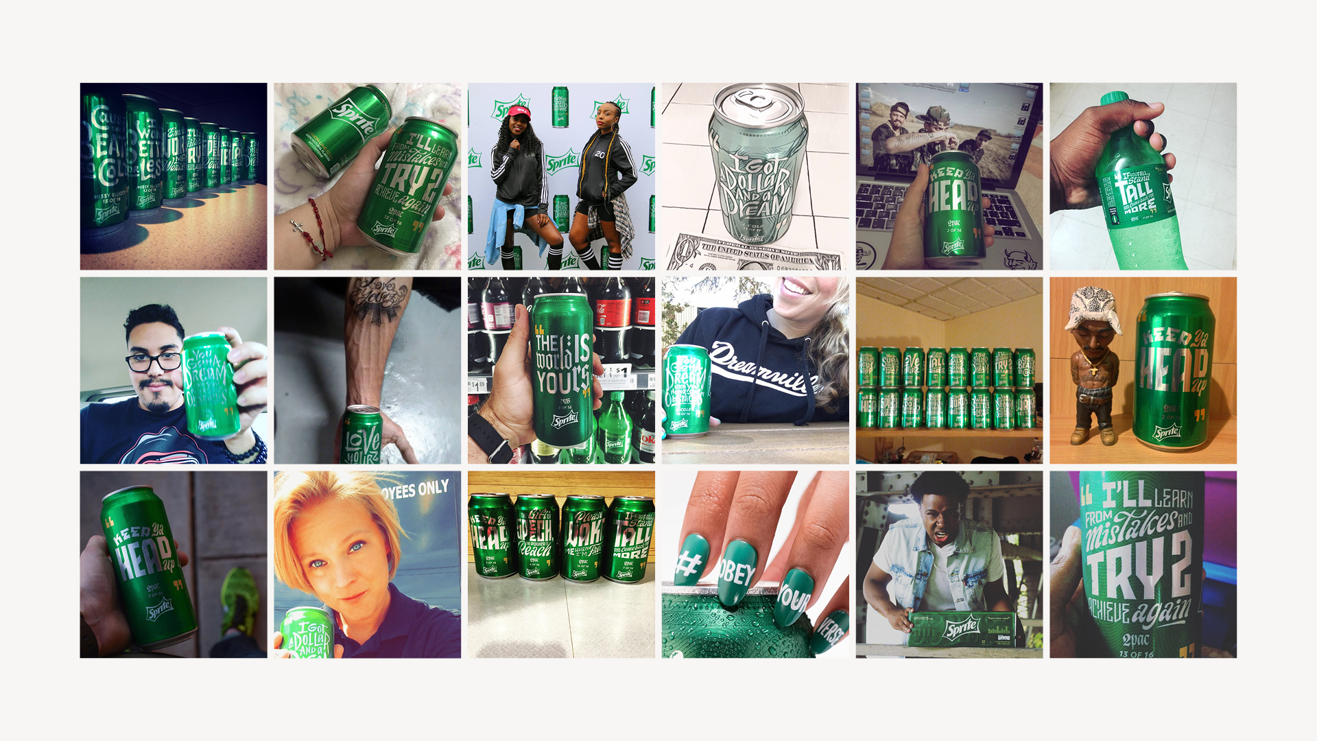
Scaling the handmade became a technique in variable-printing that Sprite led for The Coca-Cola Company. The system held through three years of evolving artists, evolving concepts, and evolving campaigns, including the “Cold” campaign of 2017, which used Erik’s custom ice-block typography. Consistent technique paired with endless customizable style gave Sprite a design language rooted in self-expression and evolving culture. The best campaigns hand culture the mic.