My way and the highway.
Mello Yello had been around for over 35 years, but most people didn’t even know it was still available. Consumer research confirmed what the shelf already suggested: the brand felt invisible. “Pretty old style.” “Reminds you of like back in the 70s and 80s.” “I’ve never really paid any attention to the look.” Mountain Dew owned the caffeinated citrus category with over 85% market share. Mello Yello wasn’t losing—it had stopped competing.
When your competitor has the category locked up, a refinement isn’t enough. You need a repositioning.
The design challenge was giving a forgotten brand a reason to be chosen—starting with who it was actually for.
Discarding the outdated playbook.
The first move was strategic: we re-engineered our approach to the consumer, discarding an outdated view of the blue-collar male. What we discovered helped redefine the category.
Research pointed to a consumer we called the Work-Proud Male—an audience connected not by income, education, or ethnicity, but by shared values. My family. My country. My craft. My downtime. These were the hunters, off-roaders, and motorsports fans of the American heartland—people who worked hard, played harder, and didn’t see themselves reflected anywhere in the category. Mountain Dew had skewed toward extreme sports and gaming. These guys were different.
The strategic insight was simple: don’t chase Mountain Dew’s audience. Claim the one they ignored. Working with United DSN, we developed a 360° brand platform around this community, anchored by a new design language: bold, uncompromising, and unapologetically theirs.
The “MY” identity.
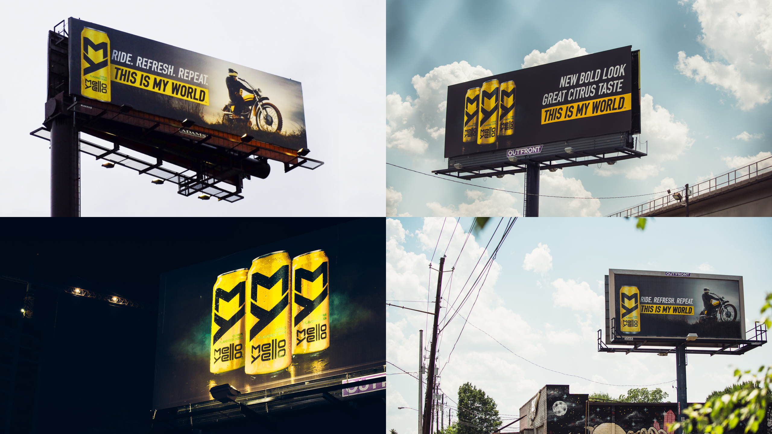
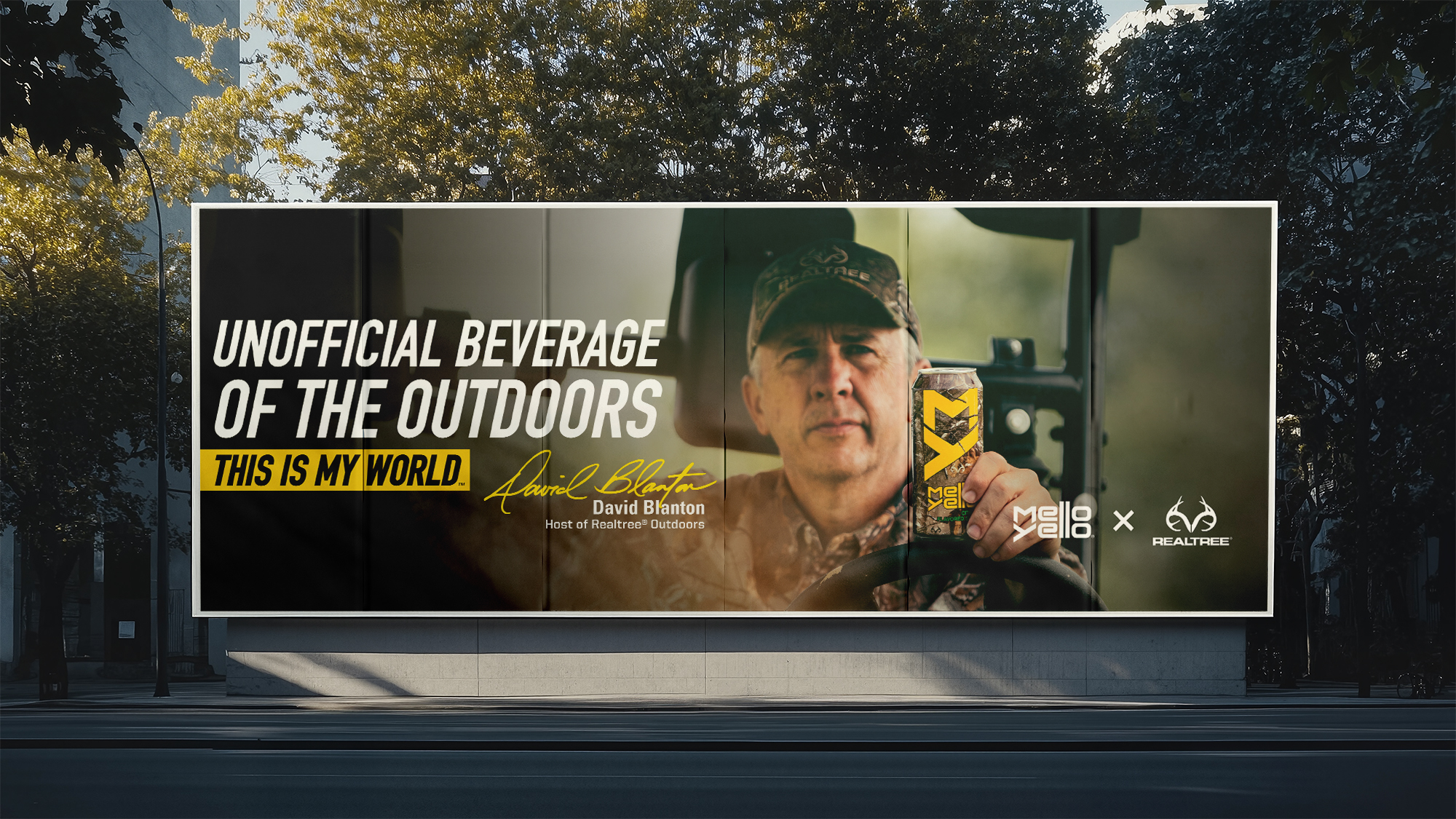
The packaging redesign centered on a single, powerful move: replacing the busy legacy label with a dominant “MY” monogram—short for Mello Yello, but instantly readable as a statement of ownership. This is MY world.
Black on electric yellow for the hero SKU. Silver on black for Zero. The brand name moved to a supporting role, letting the mark do the heavy lifting. The result was packaging that felt closer to a badge than a beverage label—something fans could identify with at a distance and display with pride.
The campaign rolled out across packaging, OOH, in-store POS, radio, and a set of brand partnerships that put Mello Yello directly into the environments its audience lived in: 25 NHRA races per year, Realtree camo collaborations, and 10 brand ambassadors across hunting and motorsports.
Shifting into higher gear.
Consumer testing validated the redesign decisively: compared to the existing brand, the new Mello Yello was rated 20% more appealing, 30% cooler, 30% more valuable looking, and 25% more likely to drive purchase. Volume was up 2% year-to-date following the campaign launch.
The Realtree camo collaboration generated 13.5M social media impressions with 90% positive sentiment. The rebrand was covered by The Dieline, Ad Age, Graphic Design USA, and Brand New. NHRA’s Mello Yello Series identity was also redesigned as part of the partnership, extending the visual language across trucks, liveries, track graphics, team apparel, and fan merchandise.
The campaign set a new commercial and cultural benchmark for the brand—and gave Mello Yello’s loyal audience something they’d never had before: a brand that looked and felt exactly like them.