Staying relevant as culture evolves
Sprite had a long, credible history with hip hop. But by the mid-2010s, hip hop had evolved from subculture to the culture. The challenge was not credibility—it was relevance.
When the culture you helped champion becomes mainstream, how do you stay part of the conversation without losing authenticity?
Sprite needed to evolve its expression by reconnecting with what made the culture meaningful in the first place.
2015: Finding an authentic way of speaking.
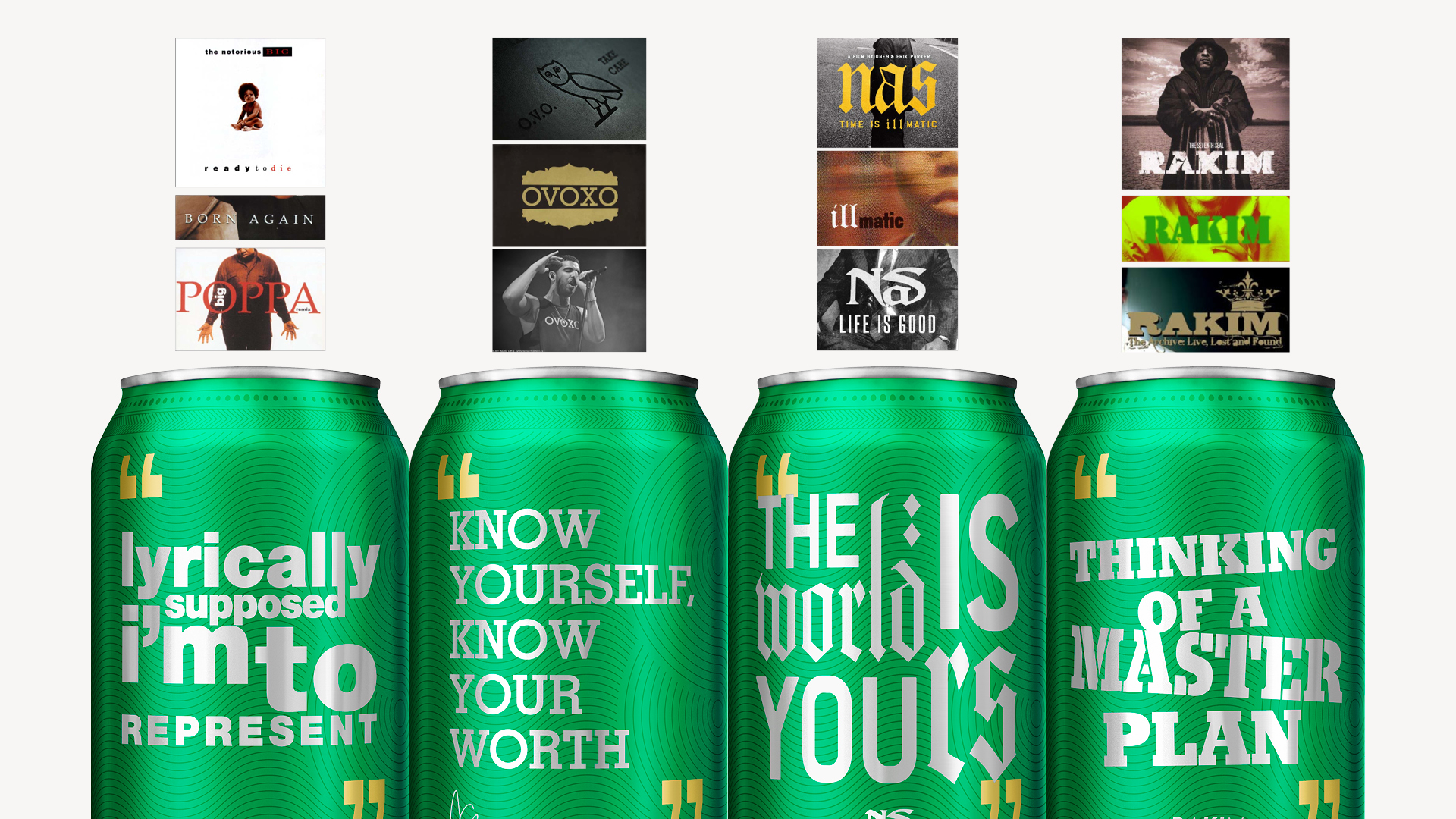
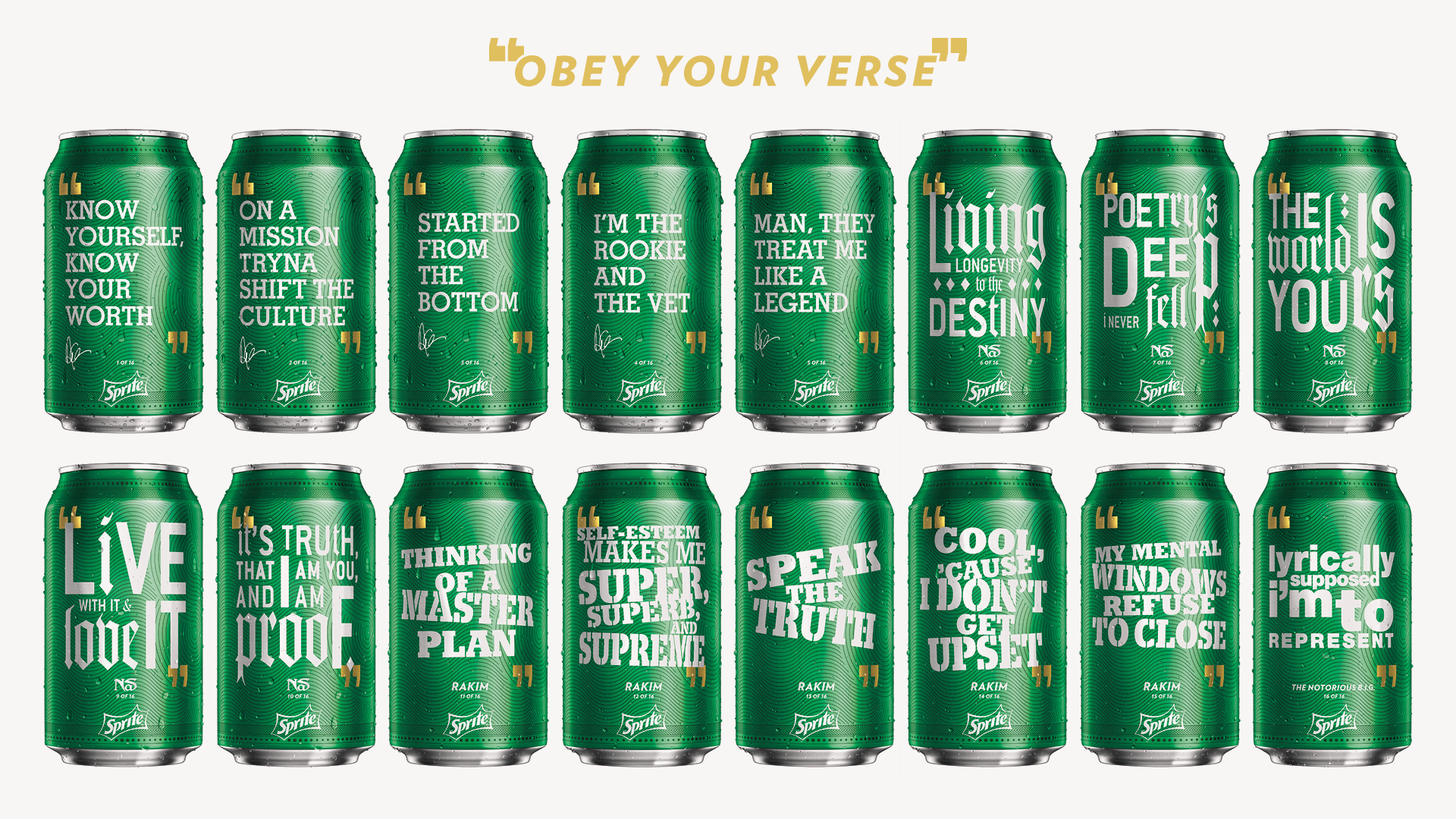
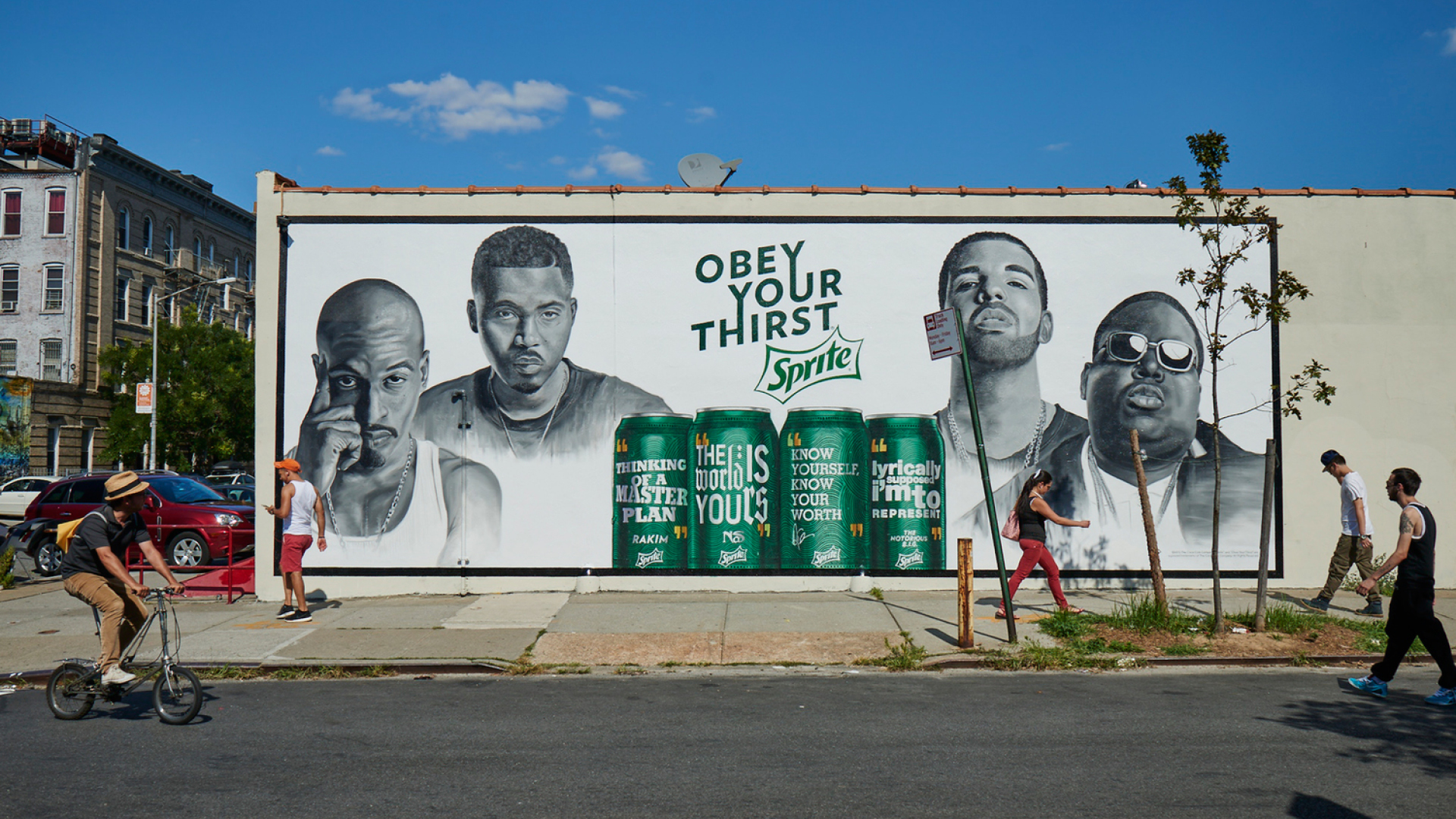
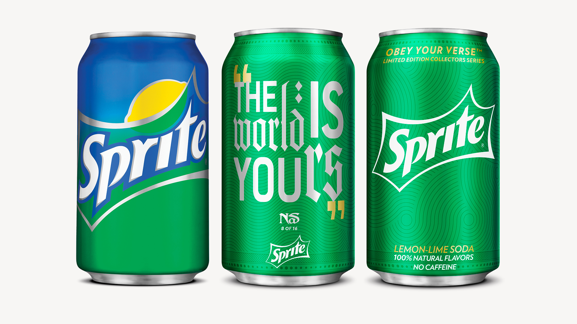
The approach was about honoring the culture’s most respected voices, using design to signal respect, restraint, and authenticity.
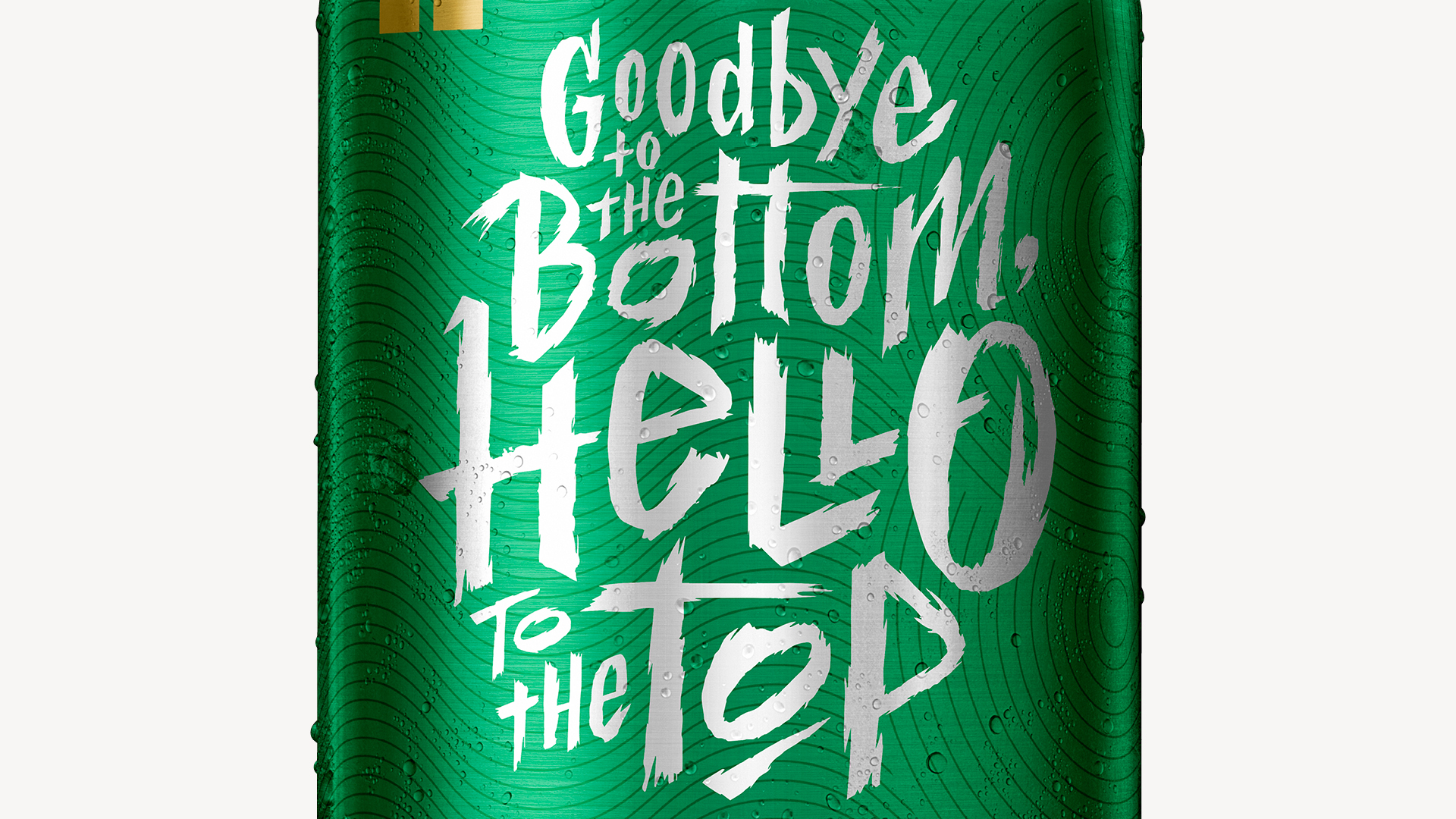
We stripped the can back to Sprite’s most iconic elements with added special nuances: full green, premium gold accents, and vinyl-inspired textures, all while giving the spotlight to the verses themselves. Typography was inspired by each artist’s album art, ensuring every can felt personal, familiar, and culturally grounded.
The goal was letting hip hop speak for itself.
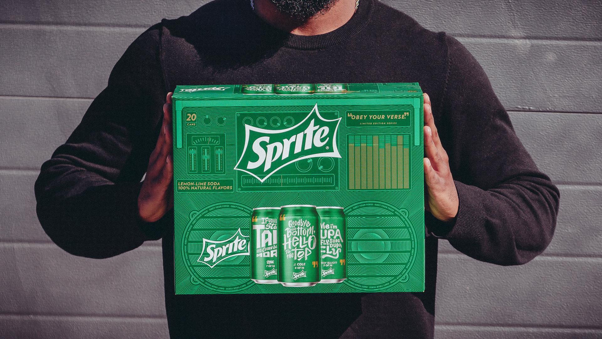
2016: Turning up the expression and building a system.
Rather than trying to reinvent the previous year, we treated the first year as a design system and preserved the simplicity and premium cues while expanding where expression mattered most.
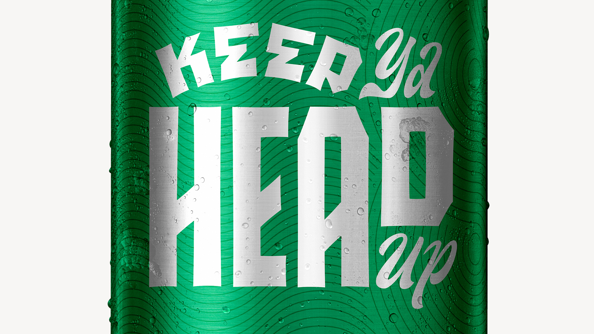
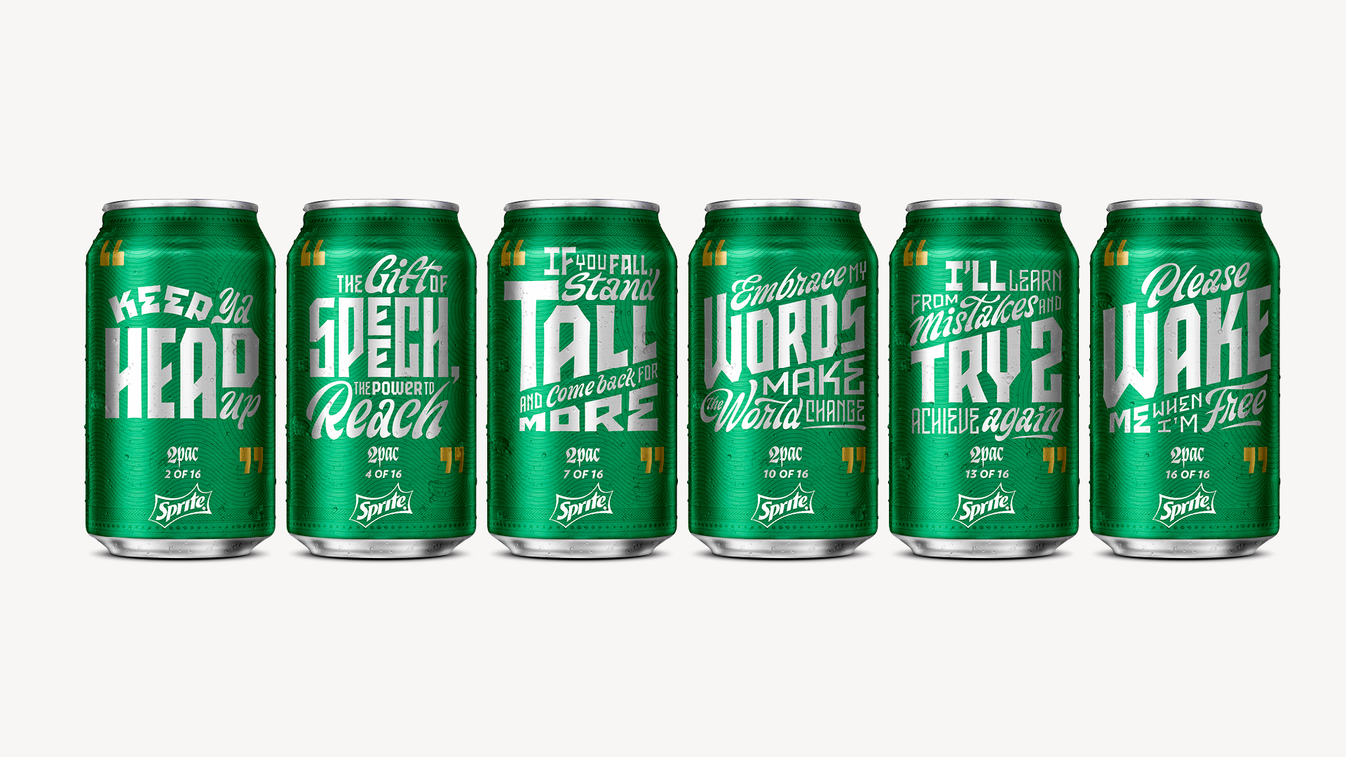
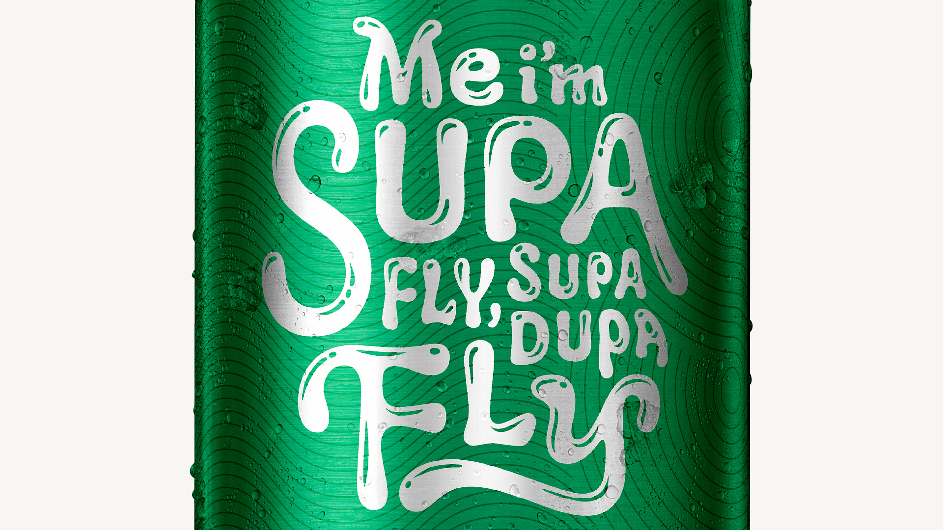
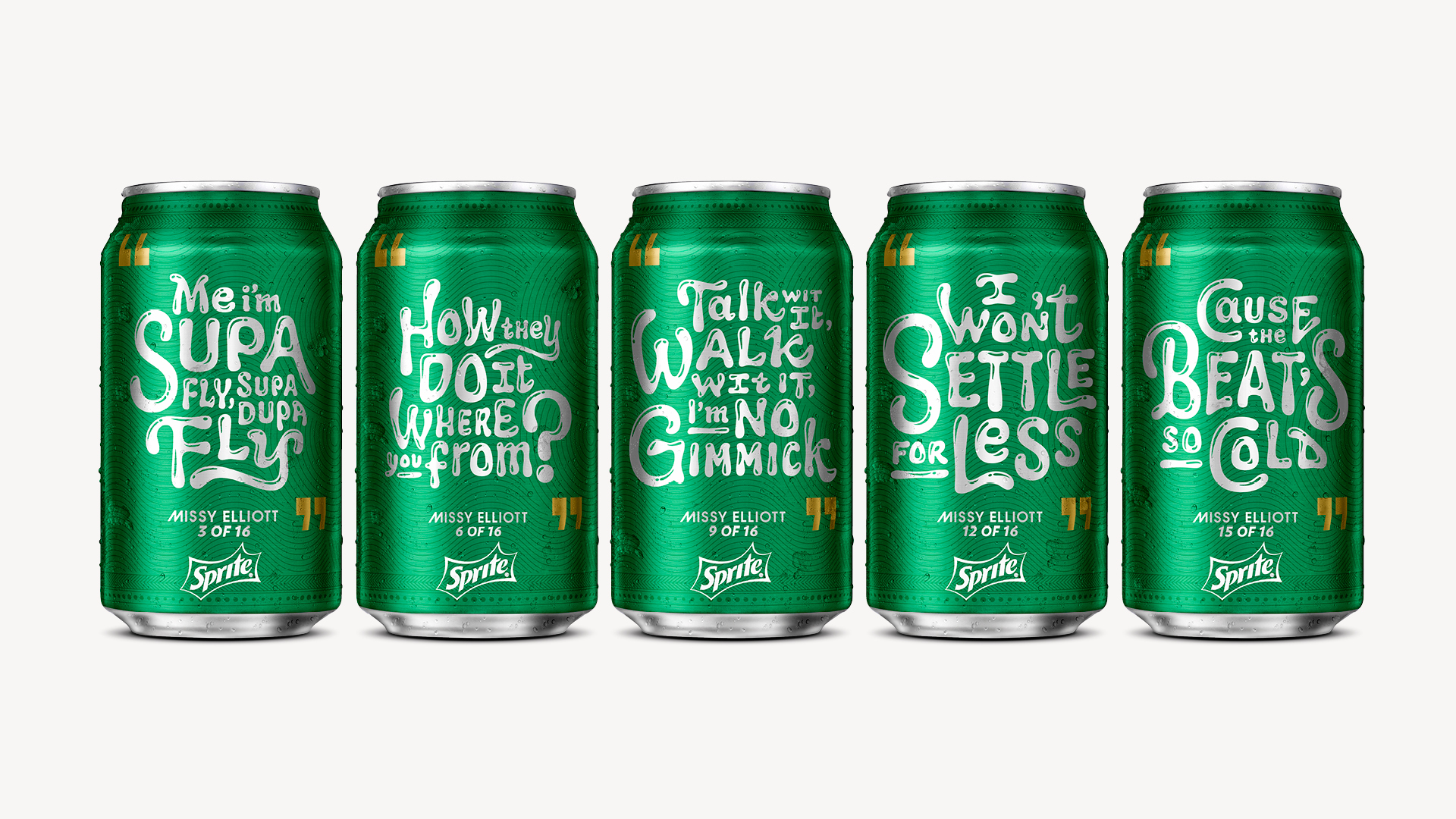
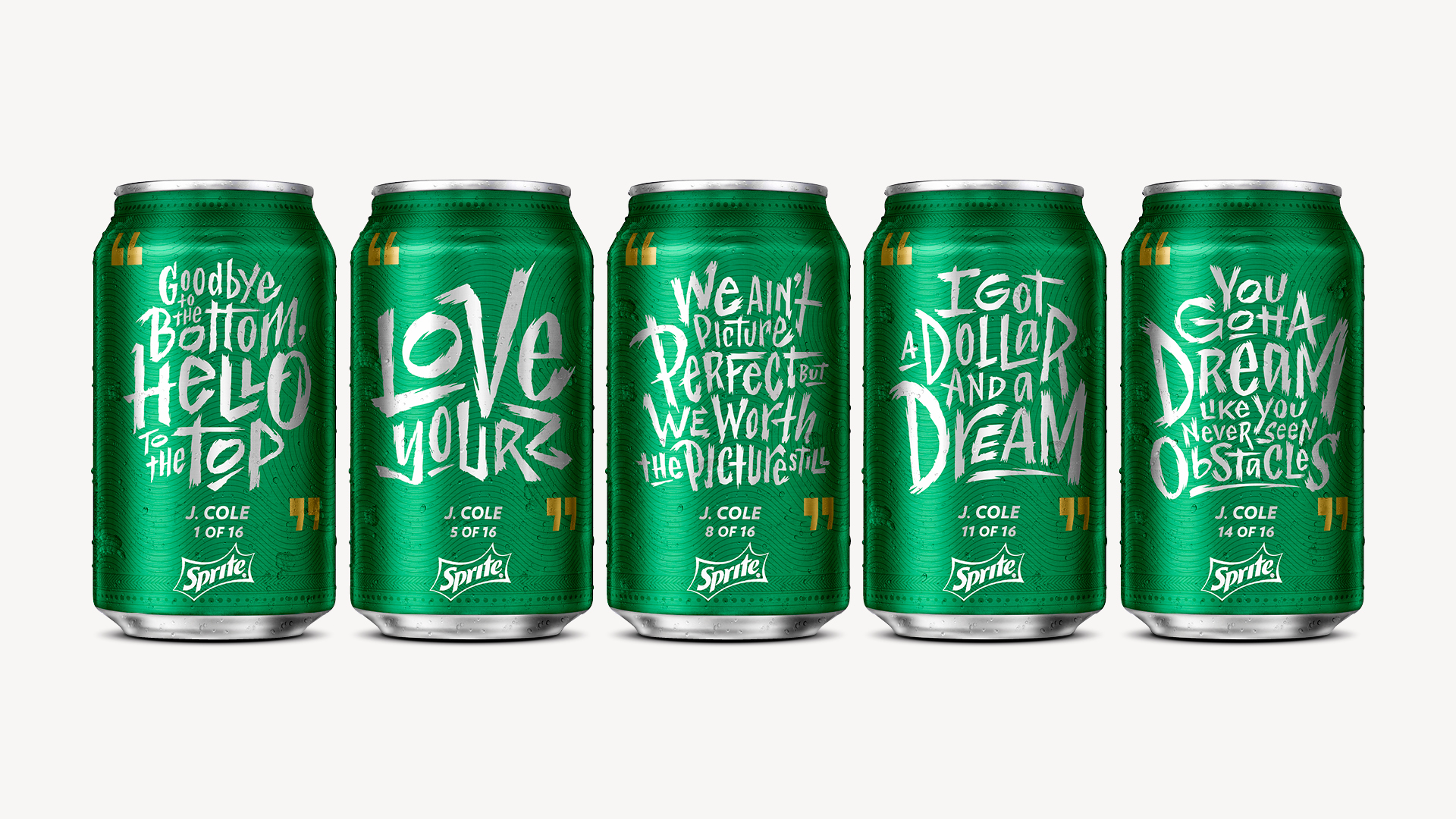
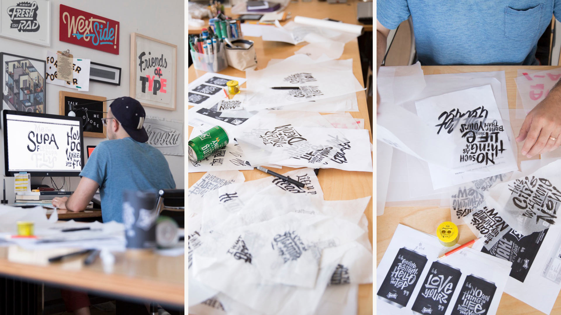
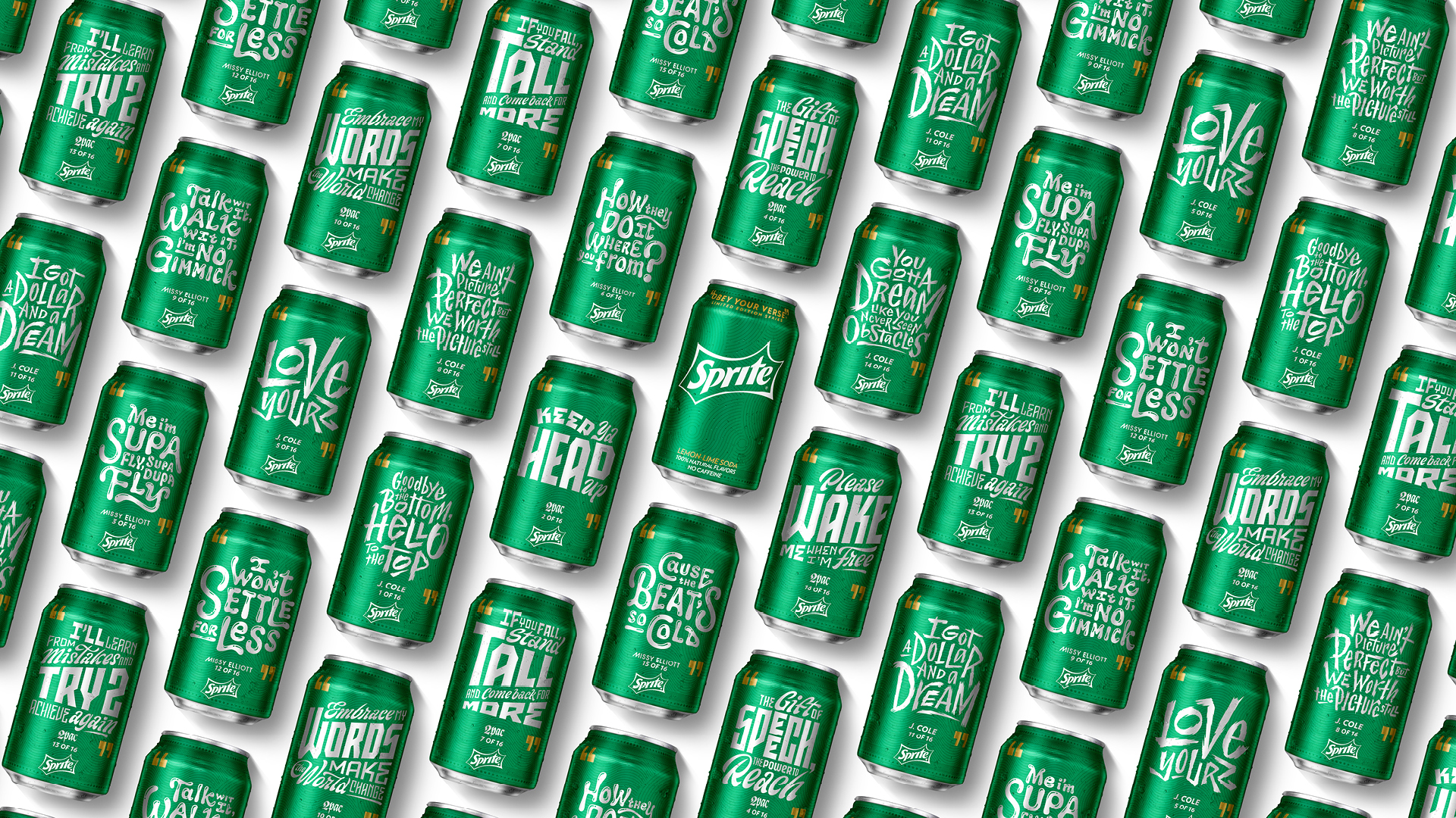
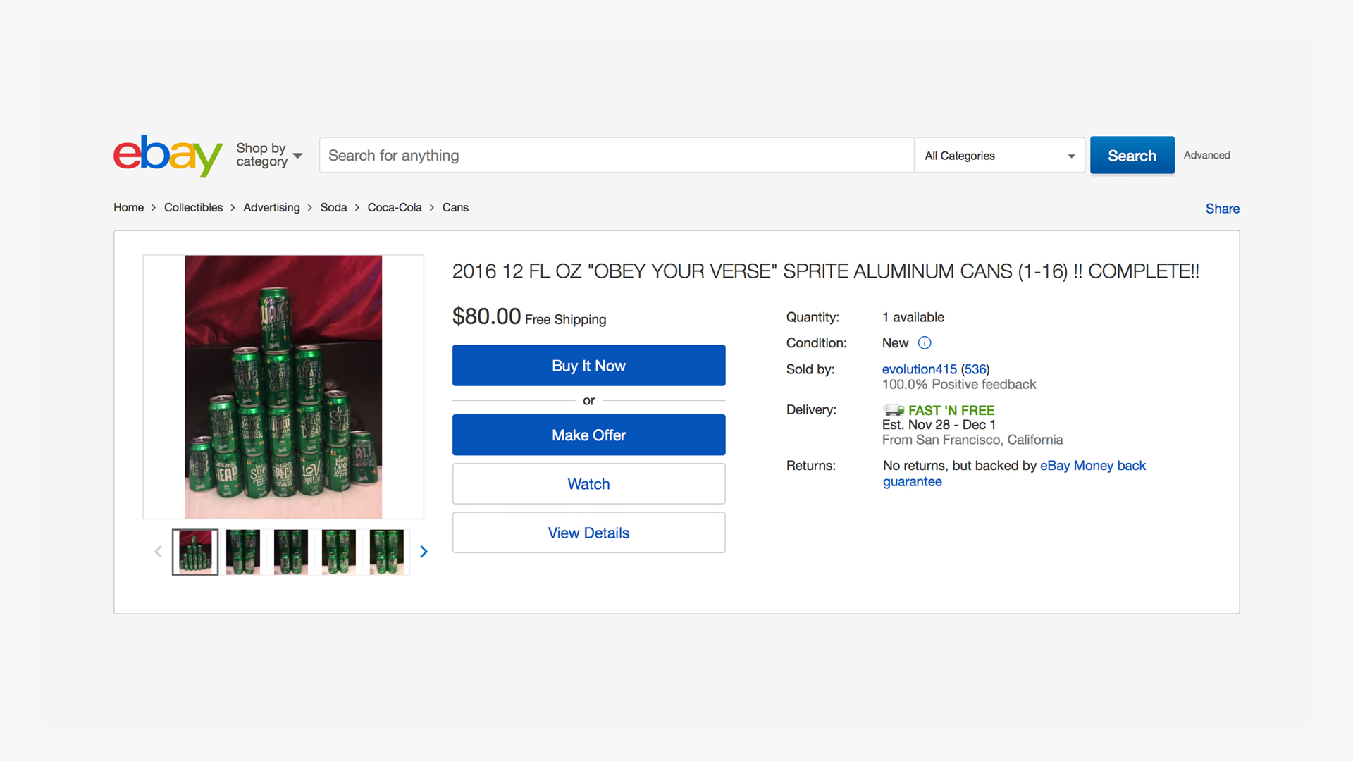
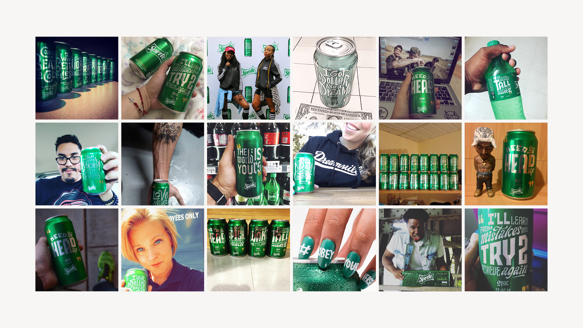
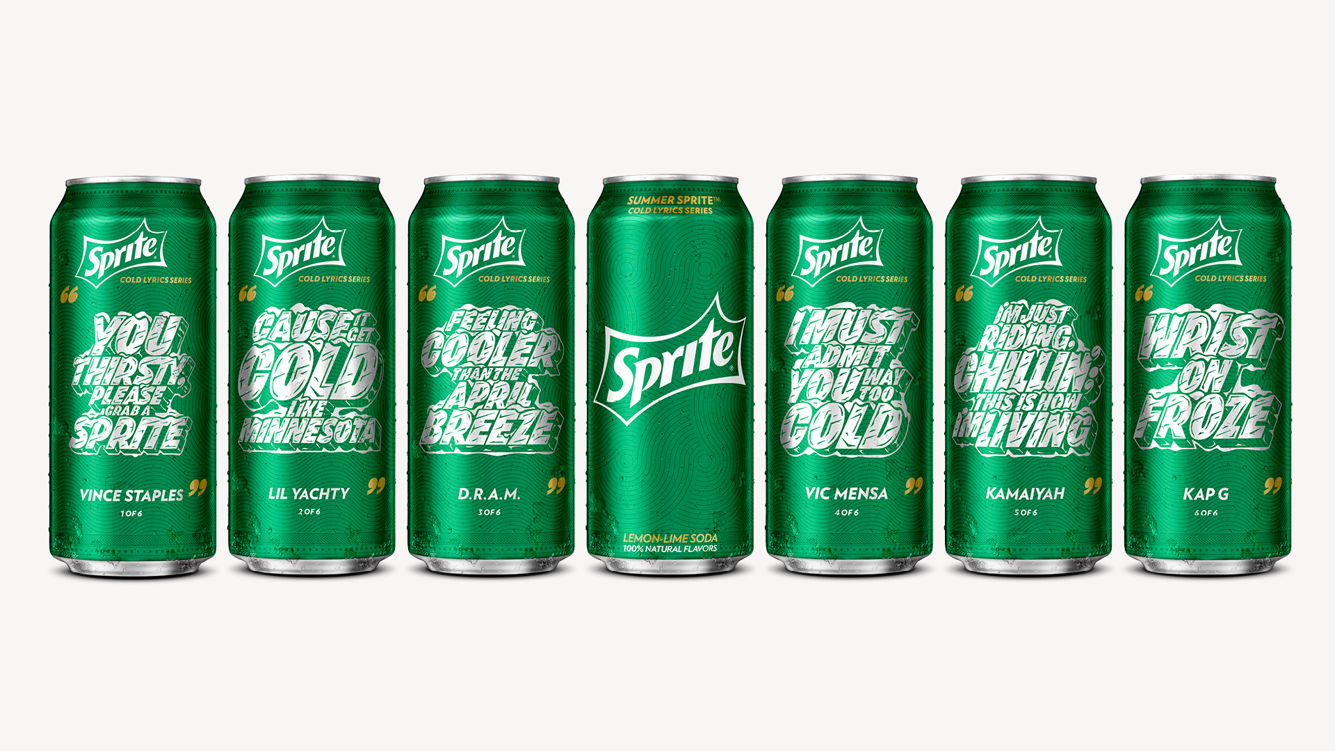
Lyric typography became the primary vehicle for personality. Inspired by a core pillar of hip hop—graffiti—we collaborated with lettering artist Erik Marinovich to hand-draw every verse. Each piece captured the rhythm, tone, and identity of its artist, transforming packaging into collectible cultural artifacts.
This system-based approach of using variable-printing techniques with custom lettering allowed the campaign to begin scaling globally whilst feeling handcrafted and emotionally resonant.
2017: Passing credibility forward.
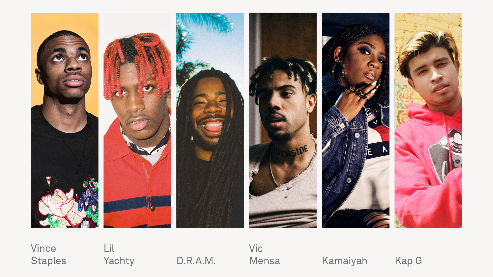
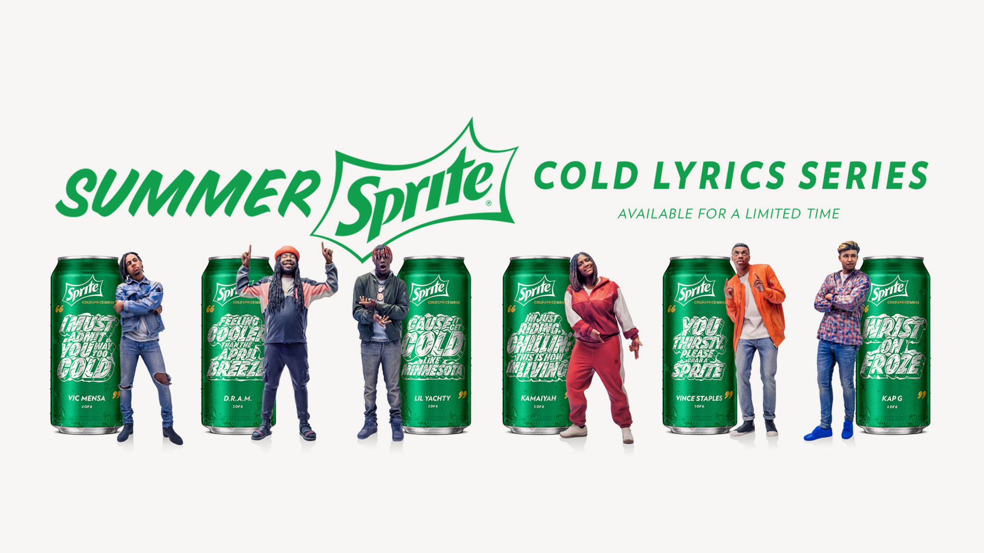
With a design system in place, Sprite could begin telling new stories and looking forward. 2017 focused on emerging artists with a curatorial credibility thanks to the previous two years.
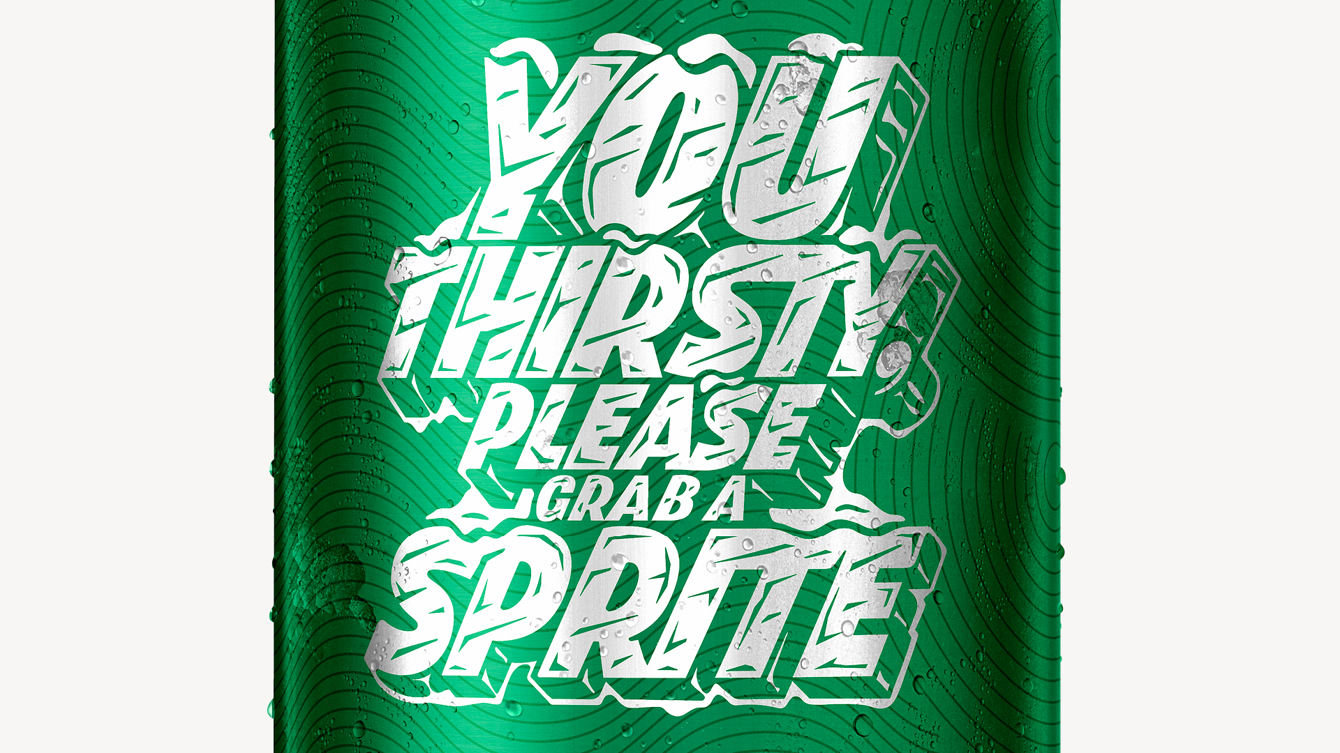
The core creative concept centered on “cold”—both as hip hop slang for skill and mastery, and as Sprite’s product truth. Working again with Erik, we created custom ice-block typography and playful OOH executions allowing the system to evolve without losing its identity or familiarity.
This final year proved the strength of the approach: when design systems are rooted in culture, they can grow with it.